Watches and Wonders Geneva 2026 took place back in April, but a few of Patek Philippe’s releases from the show deserve more than the usual rush of launch-day attention. The Nautilus naturally drew headlines during its 50th anniversary year, yet two quieter Annual Calendar references and a new World Time arguably say more about the way Patek Philippe is developing its traditional complications. The interesting part is that none of these watches tries to reinvent the complication underneath. Instead, Patek Philippe has concentrated on proportion, colour and the way familiar displays feel on the wrist. That makes them particularly interesting from a comparison point of view, because these are also the details that can separate a convincing replica from something that merely resembles the original in photographs. For readers following our wider replica watch coverage for UK readers, these releases are a useful reminder that accuracy is not just about putting the correct functions on a dial. Case dimensions, surface texture, typography and even the relationship between the strap and dial can change the character of a watch.
Thirty Years of the Patek Philippe Annual Calendar
Patek Philippe introduced its patented Annual Calendar mechanism in 1996. Its appeal has always been fairly easy to understand: it recognises months with 30 and 31 days automatically, leaving the wearer to make just one calendar correction each year at the end of February. That puts it neatly between a conventional calendar watch and a perpetual calendar. It offers a genuinely useful complication without demanding the same mechanical complexity or traditionally formal character associated with many perpetual calendars. Thirty years later, Patek Philippe has chosen to celebrate the idea with two watches that approach the Annual Calendar very differently.
Patek Philippe Ref. 4946G-001 Feels Less Formal Than Expected
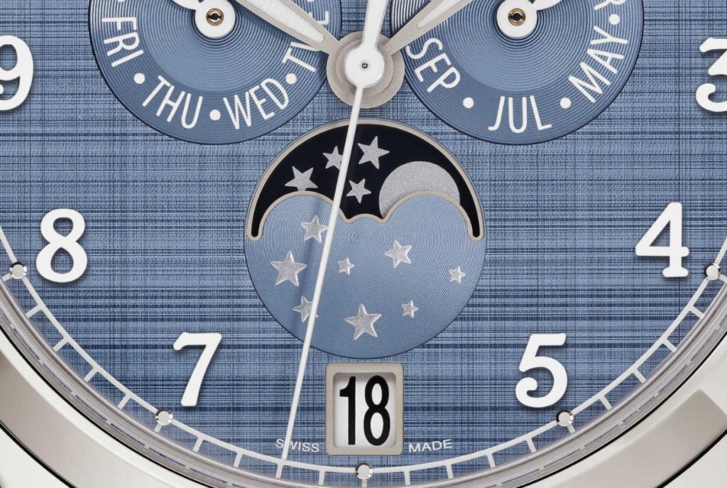
The Ref. 4946G-001 is probably the more surprising of the two. Its white-gold case measures 38mm across, which is a sensible size for this sort of watch. There is enough space for the calendar displays to breathe without making the case feel oversized. More importantly, the restrained diameter keeps the watch close to the elegant proportions that have traditionally suited complicated Patek Philippe models. The dial is where the personality changes. Instead of the polished or traditionally opaline finish one might expect, Patek Philippe uses a blue-grey surface finished with vertical and horizontal satin brushing. The crossed texture is intended to recall shantung silk, and in photographs it gives the dial a softer, almost woven appearance. That matters more than it might sound. A flat blue-grey dial would make the watch feel considerably more ordinary. Here, the changing texture helps break up what is otherwise a fairly information-heavy layout. Applied Arabic numerals filled with white luminous material also make the watch more casual. Combined with the blue-grey calfskin strap, which has been finished with a denim-like pattern, the result feels less like a traditional complicated dress watch and more like something intended for regular use. For anyone examining Patek Philippe Annual Calendar replica watch details, this dial would be one of the first areas worth inspecting closely. Getting the colour roughly right is not enough. The direction of the brushing, the way it catches light and the depth of the applied numerals all contribute to the appearance of the genuine watch.
The Display Still Feels Familiar
The calendar arrangement itself is classic Patek Philippe. Day and month are indicated by hands in the upper half of the dial, the date appears through an aperture at 6 o’clock and the moon-phase display sits below. This layout gives the dial a fairly open appearance despite the amount of information being shown. Inside is the self-winding Calibre 26-330 S QA LU. It operates at 4Hz and provides roughly 35 to 45 hours of power reserve. The movement is important, but visually I think the success of the 4946G lies elsewhere. The combination of a 38mm white gold Annual Calendar case with an unusually textured dial makes the watch feel more contemporary without forcing Patek Philippe to redesign the complication itself.
Ref. 5396R-016 Takes the More Traditional Route
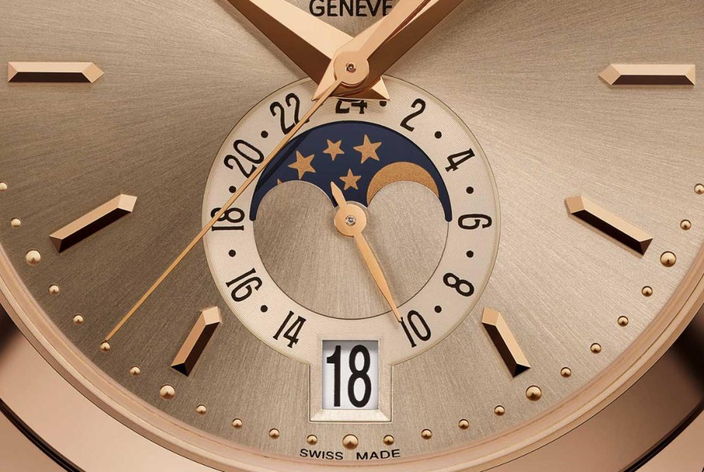
The Ref. 5396R-016 feels very different even though it belongs to the same Annual Calendar family. Its rose-gold case measures 38.5mm and is 11.2mm thick. Those proportions are restrained by modern standards, and that works particularly well with the more traditional dial architecture. Day and month sit in two apertures beneath 12 o’clock. The date appears at 6, where the moon phase and 24-hour indication are also integrated into the lower portion of the dial. The arrangement is symmetrical and easy to understand. There is little visual experimentation here because there does not need to be. The main change for 2026 is colour. Patek Philippe has paired the rose-gold case with a sunburst sand-beige dial. Rose-gold applied markers and dauphine-style hands keep the palette deliberately warm rather than introducing strong contrast. It would have been easy for that combination to become overly decorative, but the relatively compact case keeps the watch controlled. This is a good example of why rose gold Annual Calendar case and dial proportions matter as much as the individual materials themselves. On a replica, getting the dial colour slightly too yellow, too silver or too glossy could alter the entire character of the watch. The genuine model relies on fairly subtle tonal differences rather than sharp contrast.
The Two Annual Calendars Do Not Use Exactly the Same Movement
This is a small technical distinction, but it is worth making clearly. The 4946G-001 uses the Calibre 26-330 S QA LU, while the 5396R-016 uses the Calibre 26-330 S QA LU 24H. The second movement incorporates the 24-hour indication used by the 5396R display. They come from the same modern movement family, but describing them simply as identical movements misses an important difference in how the two watches present information. This is also the sort of detail worth checking when looking at higher-end replicas or super clone interpretations. A decorated movement can look convincing through a sapphire case back while still failing to reproduce the architecture or functions of the reference it is supposed to imitate.
The Ref. 7129J-001 Brings a Different Kind of Colour
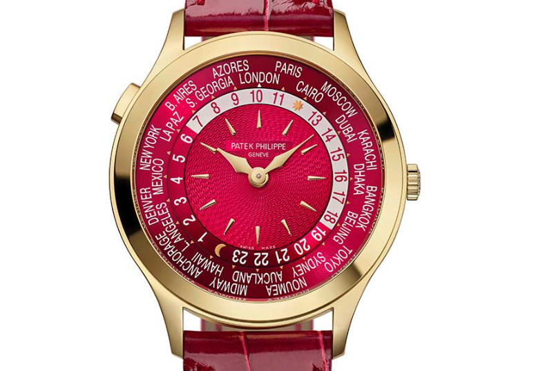
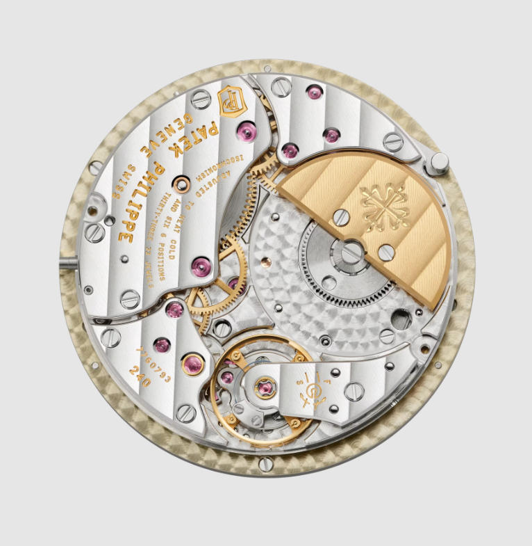
The third watch is not an Annual Calendar at all. Patek Philippe’s Ref. 7129J-001 returns to the World Time complication with a 36mm yellow-gold case and a far stronger visual identity. The centre of the dial is finished in carmine red and decorated with a hand-guilloché basket-weave pattern. Around it sits the familiar city ring, while the 24-hour scale allows the wearer to read time across the world’s 24 main time zones. The 36mm case is important here. World Time watches already contain a large amount of information, so increasing the diameter would have been an easy way to improve legibility. Patek Philippe instead keeps the proportions compact. I think that decision gives the watch much of its charm. The dial is busy, bright and technically complicated, yet the case remains restrained. Inside is the Calibre 240 HU, an ultra-thin automatic movement using an off-centre micro-rotor. The movement has long been closely associated with Patek Philippe’s World Time watches, so the new reference is really about presentation rather than an entirely new technical platform.
Why the World Time Is Difficult to Reproduce Well
From a replica perspective, the 7129J may actually be more challenging than either of the Annual Calendars. The first problem is obvious: there is a lot happening on the dial. City names have to be correctly positioned and printed at the right scale. The 24-hour ring needs the correct spacing. The centre guilloché pattern needs depth rather than looking like a printed graphic, and the shade of red has to work with the yellow tone of the case. More importantly, the World Time function itself needs to behave convincingly. A watch that looks similar in a static photograph but does not coordinate the local time, city disk and 24-hour display properly misses the central point of the reference. For that reason, a Patek Philippe World Time replica comparison should pay at least as much attention to operation as to dial colour. Readers interested in the broader range can also browse our Patek Philippe replica watches section, where older Nautilus, Calatrava and complication references can be compared with newer releases.
What I Would Look at First on a Replica Version
If replica factories eventually interpret these 2026 references, I would not start by asking whether the movement engraving looks impressive. I would begin with the parts visible every time the watch is worn. On the 4946G, the main test would be the blue-grey dial texture. It needs to react to changing light rather than appearing uniformly printed. The white-gold case should also remain visually restrained rather than looking excessively bright. On the 5396R, colour balance becomes more important. The sand-beige dial needs to sit naturally beside the rose-gold case, and the apertures at 12 o’clock need clean alignment. Even small spacing errors become noticeable because the dial is so symmetrical. On the 7129J, the city ring and central decoration would be the obvious inspection points. A convincing example would need crisp typography and a centre pattern with real visual depth. These are the sorts of small dial and case details that separate higher quality super clone watches from replicas that depend mainly on a familiar logo and broadly similar colours.
Three Watches With Very Different Personalities
What I like about these releases is that Patek Philippe has not tried to make the anniversary louder than it needs to be. The 4946G makes the Annual Calendar feel younger through texture and a more casual strap. The 5396R stays closer to the traditional idea of a complicated Patek Philippe but softens it with warmer colours. The 7129J goes in the opposite direction, pairing an established World Time mechanism with one of the strongest dial colours in the current complication range. None of the three depends on a completely new mechanical concept. That is precisely why the details matter. For collectors of genuine Patek Philippe watches, these variations show how much can change through proportion, finish and colour alone. For people studying the replica market, they also provide a useful lesson: reproducing the name of a complication is relatively easy. Reproducing the character of the watch is much harder. That distinction is where the most interesting comparisons usually begin.
Author

Related posts
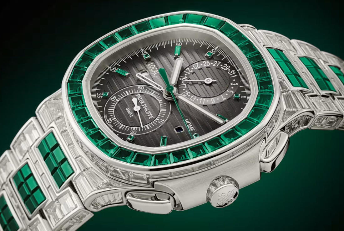
Off-Catalogue No More: UK Perfect Replica Patek Philippe Reveals Gem-Set Nautilus Watches
Today, AAA fake Patek Philippe watches updated its website to include a slew of formerly off-catalogue haute joaillerie models. While none are...
Read out all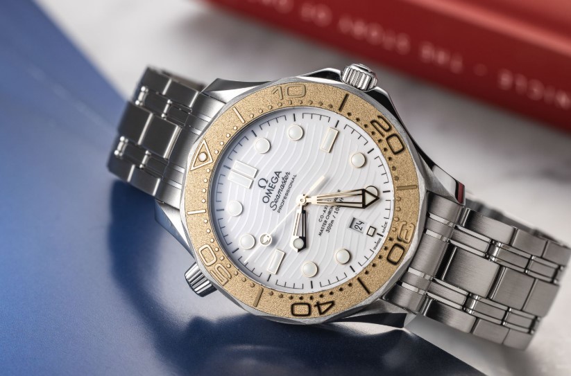
Top Replica Omega Watches UK — Olympic Games Special Editions
Another Friday, another list! This week, we decided to skip our best-of-2024 lists and focus on watches commemorating the Olympic Games. With...
Read out all
How UK Buyers Have Become More Selective About Replica Watches Over Time
Discussions around replica watches in the UK have changed noticeably over the past few years. What was once a broad, often superficial...
Read out all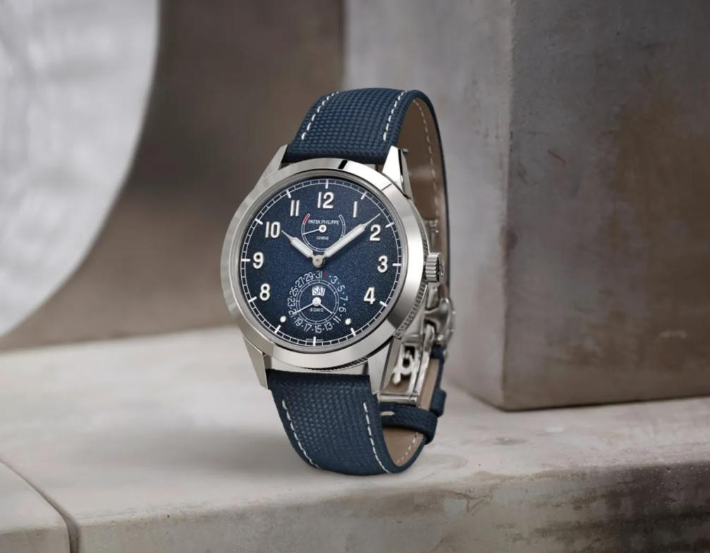
Watches and Wonders 2025: 3 Notable Watch Releases From UK Best Replica Patek Philippe Watches
We were back in Geneva this year for the annual top fake watches UK and Wonders exhibition fair. Sixty participating brands gathered...
Read out allReplica Watches UK – Hot Sale & Cheap
Shop AAA+ Rolex Super Clone Wrist Watches – 1:1 Swiss Movement, Fast Shipping, Trusted UK Store, Premium Quality, 2025 Deals Imagine the...
Read out all
Buy 1:1 Fake Watches UK Inspired By The Legendary Patek Philippe 1518 In Steel
In the world of horology, certain timepieces transcend their functional purpose and become cultural icons. Few watches embody this phenomenon more than...
Read out all